Configuration#
There are a number of options for configuring your site’s look and feel.
All configuration options are passed with the html_theme_options variable
in your conf.py file. This is a dictionary with key: val pairs that
you can configure in various ways. This page describes the options available to you.
Configure project logo#
To add a logo that’s placed at the left of your nav bar, put a logo file under your doc path’s _static folder, and use the following configuration:
html_logo = "_static/logo.png"
The logo links to master_doc (usually the first page of your documentation) by default.
If you’d like it to link to another page or use an external link instead, use the following configuration:
html_theme_options = {
    "logo_link": "<other page or external link>"
}
Configure icon links#
You can add icon links to show up to the right of your main navigation bar.
These links take the following form:
html_theme_options = {
    ...
    "icon_links": [
        {
            # Label for this link
            "name": "GitHub",
            # URL where the link will redirect
            "url": "https://github.com/<your-org>/<your-repo>",  # required
            # Icon class (if "type": "fontawesome"), or path to local image (if "type": "local")
            "icon": "fab fa-github-square",
            # Whether icon should be a FontAwesome class, or a local file
            "type": "fontawesome OR local",  # Default is fontawesome
        }
   ]
}
There are two kinds of icons you can use, described below:
FontAwesome icons#
FontAwesome is a collection of icons that are commonly used in websites. They include both generic shape icons (e.g., “arrow-down”), as well as brand-specific icons (e.g. “github”).
You can use FontAwesome icons by specifying "type": "fontawesome", and
specifying a FontAwesome class in the icon value.
The value of icon can be any full
FontAwesome 5 Free icon.
In addition to the main icon class, e.g. fa-cat, the “style” class must
also be provided e.g. fab for branding, or fas for solid.
Here are several examples:
html_theme_options = {
    ...
    "icon_links": [
        {
            "name": "GitHub",
            "url": "https://github.com/<your-org>/<your-repo>",
            "icon": "fab fa-github-square",
            "type": "fontawesome",
        },
        {
            "name": "GitLab",
            "url": "https://gitlab.com/<your-org>/<your-repo>",
            "icon": "fab fa-gitlab",
            "type": "fontawesome",
        },
        {
            "name": "Twitter",
            "url": "https://twitter.com/<your-handle>",
            "icon": "fab fa-twitter-square",
            # The default for `type` is `fontawesome` so it is not actually required in any of the above examples as it is shown here
        },
    ],
    ...
}
Hint
To get custom colors like “Twitter blue”, use the following in your CSS,
e.g. custom.css:
i.fa-twitter-square:before {
   color: #55acee;
}
This has already been added for the brands that have shortcuts.
Local image icons#
If you’d like to display an icon image that is not in the FontAwesome icons library,
you may instead specify a path to a local image that will be used for the icon.
To do so, use "type": "local", and add a path to an image
relative to your documentation root in the icon value.
Here is an example:
html_theme_options = {
    ...
    "icon_links": [
        {
            "name": "PyData",
            "url": "https://pydata.org",
            "icon": "_static/pydata-logo-square.png",
            "type": "local",
        },
    ],
    ...
}
Tip
Use .svg images for a higher-resolution output that behaves similarly across screen sizes.
Icon Link Shortcuts#
There are a few shortcuts supported to minimize configuration for commonly-used services.
These may be removed in a future release in favor of icon_links:
html_theme_options = {
    ...
    "github_url": "https://github.com/<your-org>/<your-repo>",
    "gitlab_url": "https://gitlab.com/<your-org>/<your-repo>",
    "bitbucket_url": "https://bitbucket.org/<your-org>/<your-repo>",
    "twitter_url": "https://twitter.com/<your-handle>",
    ...
}
Additionally, the screen-reader accessible label for this menu can be configured:
html_theme_options = {
    ...
    "icon_links_label": "Quick Links",
    ...
}
Adding favicons#
pydata_sphinx_theme supports the
standard sphinx favicon configuration,
using html_favicon.
Additionally, pydata_sphinx_theme allows you to add any number of
browser- or device-specific favicons of any size. To define arbitrary favicons,
use the favicons configuration key. The href value can be either an
absolute URL (beginning with http) or a local path relative to your
html_static_path:
html_theme_options = {
   "favicons": [
      {
         "rel": "icon",
         "sizes": "16x16",
         "href": "https://secure.example.com/favicon/favicon-16x16.png",
      },
      {
         "rel": "icon",
         "sizes": "32x32",
         "href": "favicon-32x32.png",
      },
      {
         "rel": "apple-touch-icon",
         "sizes": "180x180",
         "href": "apple-touch-icon-180x180.png"
      },
   ]
}
pydata_sphinx_theme will add link tags to your document’s head
section, following this pattern:
<link rel="{{ favicon.rel }}" sizes="{{ favicon.sizes }}" href="{{ favicon.href }}">
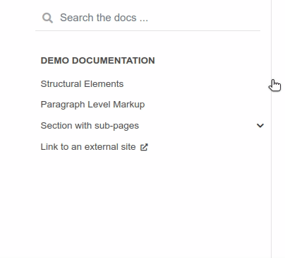
Navigation depth and collapsing the sidebar#
By default, this theme enables to expand/collapse subsections in the left sidebar navigation (without actually navigating to the page itself), and this extends up to 4 levels deep:
Add a dropdown to switch between docs versions#
You can add a button to your site that allows users to
switch between versions of your documentation. The links in the version
switcher will differ depending on which page of the docs is being viewed. For
example, on the page https://mysite.org/en/v2.0/changelog.html, the
switcher links will go to changelog.html in the other versions of your
docs. When clicked, the switcher will check for the existence of that page, and
if it doesn’t exist, redirect to the homepage of that docs version instead.
The switcher requires the following configuration steps:
Add a JSON file containing a list of the documentation versions that the switcher should show on each page.
Add a configuration dictionary called
switcherto thehtml_theme_optionsdict inconf.py.switchershould have 3 keys:json_url: the persistent location of the JSON file described above.version_match: a string stating the version of the documentation that is currently being browsed.
Specify where to place the switcher in your page layout. For example, add the
"version-switcher"template to one of the layout lists inhtml_theme_options(e.g.,navbar_end,footer_items, etc).
Below is a more in-depth description of each of these configuration steps.
Add a JSON file to define your switcher’s versions#
First, write a JSON file stating which versions of your docs will be listed in the switcher’s dropdown menu. That file should contain a list of entries that each can have the following fields:
version: a version string. This is checked againstswitcher['version_match']to provide styling to the switcher.url: the URL for this version.name: an optional name to display in the switcher dropdown instead of the version string (e.g., “latest”, “stable”, “dev”, etc).
Here is an example JSON file:
[
    {
        "name": "v2.1 (stable)",
        "version": "2.1",
        "url": "https://mysite.org/en/2.1/index.html"
    },
    {
        "version": "2.1rc1",
        "url": "https://mysite.org/en/2.1rc1/index.html"
    },
    {
        "version": "2.0",
        "url": "https://mysite.org/en/2.0/index.html"
    },
    {
        "version": "1.0",
        "url": "https://mysite.org/en/1.0/index.html"
    }
]
See the discussion of switcher['json_url'] (below) for options of where to
save the JSON file.
Configure switcher['json_url']#
The JSON file needs to be at a stable, persistent, fully-resolved URL (i.e., not specified as a path relative to the sphinx root of the current doc build). Each version of your documentation should point to the same URL, so that as new versions are added to the JSON file all the older versions of the docs will gain switcher dropdown entries linking to the new versions. This could be done a few different ways:
The location could be one that is always associated with the most recent documentation build (i.e., if your docs server aliases “latest” to the most recent version, it could point to a location in the build tree of version “latest”). For example:
html_theme_options = {
    ...,
    "switcher": {
        "json_url": "https://mysite.org/en/latest/_static/switcher.json",
    }
}
In this case the JSON is versioned alongside the rest of the docs pages but only the most recent version is ever loaded (even by older versions of the docs).
The JSON could be saved in a folder that is listed under your site’s
html_static_pathconfiguration. See the Sphinx static path documentation for more information.The JSON could be stored outside the doc build trees. This probably means it would be outside the software repo, and would require you to add new version entries to the JSON file manually as part of your release process. Example:
html_theme_options = {
    ...,
    "switcher": {
        "json_url": "https://mysite.org/switcher.json",
    }
}
Configure switcher['version_match']#
This configuration value tells the switcher what docs version is currently being viewed, and is used to style the switcher (i.e., to highlight the current docs version in the switcher’s dropdown menu, and to change the text displayed on the switcher button).
Typically you can re-use one of the sphinx variables version
or release as the value of switcher['version_match']; which one you use
depends on how granular your docs versioning is. See
the Sphinx “project info” documentation
for more information). Example:
version = my_package_name.__version__.replace("dev0", "")  # may differ
html_theme_options = {
    ...,
    "switcher": {
        "version_match": version,
    }
}
Specify where to display the switcher#
Finally, tell the theme where on your site’s pages you want the switcher to
appear. There are many choices here: you can add "version-switcher" to one
of the locations in html_theme_options (e.g., navbar_end,
footer_items, etc). For example:
html_theme_options = {
   ...,
   "navbar_end": ["version-switcher"]
}
Alternatively, you could override one of the other templates to include the
version switcher in a sidebar. For example, you could define
_templates/sidebar-nav-bs.html as:
{%- include 'version-switcher.html' -%}
{{ super() }}
to insert a version switcher at the top of the left sidebar, while still keeping the default navigation below it. See Add/Remove items from theme sections for more information.
Configure the search bar position#
To modify the position of the search bar, add the search-field.html
template to your sidebar, or to one of the navbar positions, depending
on where you want it to be placed.
For example, if you’d like the search field to be in your side-bar, add it to the sidebar templates like so:
html_sidebars = {
    "**": ["search-field.html", "sidebar-nav-bs.html", "sidebar-ethical-ads.html"]
}
If instead you’d like to put the search bar in the top navbar, use the following configuration:
html_theme_options = {
    "navbar_end": ["navbar-icon-links.html", "search-field.html"]
}
Note
By default the search bar is placed in the sidebar. If you wish to move it to the navbar, explicitly define a list of sidebar templates in html_sidebars and omit the search-field.html entry.
Configure the search bar text#
To modify the text that is in the search bar before people click on it, add the
following configuration to your conf.py file:
html_theme_options = {
    "search_bar_text": "Your text here..."
}
Google Analytics#
If the google_analytics_id config option is specified (like UA-XXXXXXX),
Google Analytics’ javascript is included in the html pages.
html_theme_options = {
    "google_analytics_id": "UA-XXXXXXX",
}
Changing pages with keyboard presses#
By default, pydata-sphinx-theme allows users to move to the previous/next
page using the left/right arrow keys on a keyboard. To disable this behavior,
use the following configuration:
html_theme_options = {
  "navigation_with_keys": False
}
Show more levels of the in-page TOC by default#
Normally only the 2nd-level headers of a page are show in the right table of contents, and deeper levels are only shown when they are part of an active section (when it is scrolled on screen).
You can show deeper levels by default by using the following configuration, indicating how many levels should be displayed:
html_theme_options = {
  "show_toc_level": 2
}
All headings up to and including the level specified will now be shown regardless of what is displayed on the page.
Improve build speed and performance#
By default this theme includes all of your documentation links in a collapsible sidebar.
However, this may slow down your documentation builds considerably if you have
a lot of documentation pages. This is most common with documentation for projects
with a large API, which use the .. autosummary:: directive to generate
API documentation.
To improve the performance of your builds in these cases, see Navigation depth and collapsing the sidebar.