PyData Library Styles#
This theme has built-in support and special styling for several major visualization libraries in the PyData ecosystem. This ensures that the images and output generated by these libraries looks good for both light and dark modes. Below are examples of each that we use as a benchmark for reference.
Pandas#
import string

import numpy as np
import pandas as pd

rng = np.random.default_rng()
data = rng.standard_normal((100, 26))
df = pd.DataFrame(data, columns=list(string.ascii_lowercase))
df
| a | b | c | d | e | f | g | h | i | j | ... | q | r | s | t | u | v | w | x | y | z | |
|---|---|---|---|---|---|---|---|---|---|---|---|---|---|---|---|---|---|---|---|---|---|
| 0 | 0.621551 | -0.678011 | 1.361140 | 1.205592 | 0.413808 | 0.141885 | 1.444735 | 0.505024 | -0.942470 | -0.219441 | ... | -1.010798 | -0.867651 | 0.557123 | 2.773014 | 0.152473 | -0.273795 | 0.380190 | 0.384379 | -0.295625 | 0.378258 |
| 1 | 0.766013 | 0.758517 | -1.370940 | -0.743420 | -0.233156 | -0.851769 | 0.061132 | 0.617713 | 1.919868 | -0.086240 | ... | 2.109971 | 0.268220 | 0.648520 | -0.206540 | -0.146194 | -0.345295 | -0.268368 | -0.894535 | 0.271244 | 0.279200 |
| 2 | 1.223517 | 0.379797 | -1.041529 | 1.838098 | 2.268853 | -0.971022 | -0.137972 | 0.933401 | 0.257763 | 1.882588 | ... | -1.366165 | 0.236098 | -0.483581 | -0.307996 | -1.386614 | -2.067426 | -1.514831 | -0.868818 | 1.558775 | -0.989485 |
| 3 | 0.907914 | -0.149069 | 1.221954 | 0.615235 | 3.337798 | -1.064425 | 1.311958 | -0.687309 | -0.148470 | 1.485415 | ... | -0.367092 | 0.339240 | -0.327380 | -0.708208 | -0.704330 | 2.278505 | -0.454720 | -1.255363 | -0.840784 | 0.374169 |
| 4 | -1.257545 | -0.901319 | -0.350519 | -0.977022 | -0.269948 | 0.047105 | 0.463823 | -0.014111 | -0.598746 | 1.042452 | ... | 1.773795 | -0.133022 | 0.640026 | -0.875964 | 0.144460 | 1.093559 | -0.683122 | 0.843353 | -0.937060 | 0.046954 |
| ... | ... | ... | ... | ... | ... | ... | ... | ... | ... | ... | ... | ... | ... | ... | ... | ... | ... | ... | ... | ... | ... |
| 95 | -1.826161 | -0.860834 | -0.658106 | -0.243956 | -0.014873 | 0.253184 | 0.272784 | -0.838849 | 0.500119 | -0.226580 | ... | 0.083424 | -0.426504 | 1.378009 | -1.056087 | -1.157277 | -0.410715 | 0.583756 | 0.510852 | 0.804660 | -0.051881 |
| 96 | 0.593977 | 0.267760 | 0.658239 | -0.653321 | 0.646940 | 0.572911 | 0.092675 | -0.251702 | 2.938001 | 0.488098 | ... | 0.527836 | -0.120622 | 0.049128 | 0.103224 | -1.842633 | 1.119237 | 0.418252 | 1.496938 | -3.026498 | -0.646710 |
| 97 | -1.812710 | -1.777983 | -1.387779 | -0.352277 | 1.822589 | 1.211555 | 0.674116 | 0.016123 | -0.782162 | -0.055965 | ... | -0.327913 | 1.421829 | -1.333076 | -0.491430 | 0.665826 | -0.313587 | 0.100078 | 0.654475 | 0.900451 | -0.093777 |
| 98 | -0.323696 | -0.392730 | -0.047554 | 0.256879 | 0.484209 | 1.361722 | -0.004229 | 0.629316 | 0.347696 | -1.115283 | ... | 0.774960 | 2.108964 | 0.555739 | 0.061425 | -1.310056 | 1.548465 | 1.078677 | -0.246777 | 0.450686 | 2.976022 |
| 99 | 0.231995 | 0.472944 | -0.904920 | 0.117966 | 0.744879 | 1.018735 | -0.732656 | 0.714426 | 1.157692 | -0.814945 | ... | 0.942703 | -0.785208 | -1.413649 | 1.914664 | 0.340083 | 1.470504 | 0.328992 | -0.779164 | 0.363458 | -0.198955 |
100 rows × 26 columns
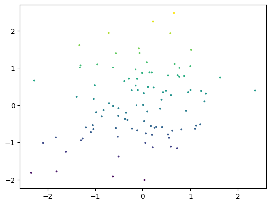
Matplotlib#
import matplotlib.pyplot as plt

fig, ax = plt.subplots()
ax.scatter(df["a"], df["b"], c=df["b"], s=3)
<matplotlib.collections.PathCollection at 0x7f3956522e50>
and with the Matplotlib plot directive:
(Source code, png, hires.png, pdf)

Plotly#
The HTML below shouldn’t display, but it uses RequireJS to make sure that all works as expected. If the widgets don’t show up, RequireJS may be broken.
import plotly.io as pio
import plotly.express as px
import plotly.offline as py

pio.renderers.default = "notebook"

df = px.data.iris()
fig = px.scatter(df, x="sepal_width", y="sepal_length", color="species", size="sepal_length")
fig
Xarray#
Here we demonstrate xarray to ensure that it shows up properly.
import xarray as xr
data = xr.DataArray(
        np.random.randn(2, 3),
        dims=("x", "y"),
        coords={"x": [10, 20]}, attrs={"foo": "bar"}
      )
data
<xarray.DataArray (x: 2, y: 3)>
array([[ 1.34060541, -0.53184925, -1.49496748],
       [-0.90791695, -0.08841657, -0.78232964]])
Coordinates:
  * x        (x) int64 10 20
Dimensions without coordinates: y
Attributes:
foo: baripyleaflet#
ipyleaflet is a Jupyter/Leaflet bridge enabling interactive maps in the Jupyter notebook environment. this demonstrate how you can integrate maps in your documentation.
from ipyleaflet import Map, basemaps
from IPython.display import display

# display a map centered on France
m = Map(basemap=basemaps.Esri.WorldImagery,  zoom=5, center=[46.21, 2.21])
display(m)
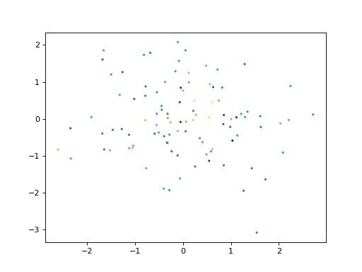
jupyter-sphinx#
This theme has styling for jupyter-sphinx, which is often used for executing and displaying widgets with a Jupyter kernel.
import matplotlib.pyplot as plt
import numpy as np

rng = np.random.default_rng()
data = rng.standard_normal((3, 100))
fig, ax = plt.subplots()
ax.scatter(data[0], data[1], c=data[2], s=3)
<matplotlib.collections.PathCollection at 0x7f2bd64cb280>
